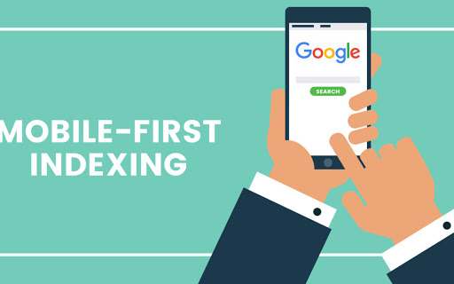
7 steps to cope with Mobile-First Indexing
Mobile-first indexing is a change that Google has recently adopted in its indexing practice. It has aroused much confusion and wrong impressions among the website owners. Hence, it is important to get a clear idea about what is mobile-first indexing and what changes should a website adopt, if any, to maintain its traffic.
Mobile-first indexing is one of the steps that Google takes to evolve into a more mobile-friendly search engine. Google used to consider the desktop version of a webpage content for evaluating whether it satisfies the user needs. The recent stats prove that more people are using Google through their smartphones than through their desktop. To cope with this scenario and to make the search engine more mobile-friendly, Google has introduced mobile-first indexing.
What is it?
By mobile-first indexing, Googlebot will crawl and index pages that are more smartphone friendly. This means that the mobile version of your website will be given more prominence while indexing. So if your website is not mobile-friendly, it can affect your ranking.
Googlebot will use a smartphone agent for this purpose. From 1st July 2019, this has been enabled for all new websites. Existing websites will be informed subsequently in Search Console about when their site was changed to the new indexing method.
What should be taken care of for maintaining traffic?
If you have a mobile version of your site which is exactly the same as the desktop version, you don’t have much to worry about. Make sure that the speed and load time of the mobile version are given priority and all visual and dynamic elements are perfectly optimized.
Points to keep in mind are:
1. Content accessibility
Make sure that your mobile content is accessible, the same as desktop content and can be rendered easily. Also, make sure that the formats are mobile-friendly and the same meta robot tags are used. Do not compromise on the quality of the visual data.
2. Structured Data
Use the same structured data in both desktop and mobile versions. Make sure to use the updated URL in mobile versions of structured data.
3. Metadata
Use the same metadata and descriptive title for both versions wherever possible.
4. Social metadata
It should be made sure that the social metadata is included in the mobile version also.
5. Verify Search Console
Most website owners would have verified their desktop site in Google search console. But many do not pay much heed to mobile versions. Be sure that you have added and verified the website’s mobile version in the Google search console.
6. Hreflang
When you use rel=hreflang for internalization, make sure that mobile URL’s hreflang annotations are directing to the mobile versions of your country or language variants. Similarly, the desktop URLs should point to the desktop versions.
7. Media sitemaps and XML
Make sure that the links to sitemaps are accessible in the mobile versions of the site also.